
In den letzen Wochen habe ich mich intensiver mit dem Stil des Spontanrealimus und dessen Umsetzung in die digitale Malerei beschäftigt. Dabei ist eine gewisse Faszination entstanden, die mich mehr und mehr in ihren Bann zieht. Es ist eine kleine Serie von Porträts klassischer Komponisten entstanden, die ich mit Sicherheit noch fortsetzen werde. Heute stelle ich euch den Werdegang meines neuesten Porträts von Giacomo Puccini vor. Außerdem könnt ihr am Ende des Artikels 4 weitere Crazy Canvases in hoher Auflösung zur freien Verwendung herunterladen.
In the last few weeks I have been working more intensively with the style of spontaneous realism and its implementation in digital painting. In the process, a certain fascination has arisen that is captivating me more and more. A small series of portraits of classical composers has emerged, which I will certainly continue. Today I present the making of my latest portrait of Giacomo Puccini. You can also download 4 more Crazy Canvases in high resolution for free use at the end of the article.
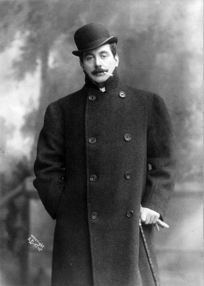
Giacomo Puccini 1908 - Foto: A. Dupont
Das ist das Foto, nach welchem ich das Porträt gemalt habe. Ich benutze gerade bei Bildern des Spontanrealismus ausschließlich schwarz/weiß Fotos als Referenzvorlage. Damit beuge ich der Versuchung vor, realistische Hauttöne malen zu wollen, und es gibt mir die Freiheit in der Auswahl der Farbtöne. Ich habe gelernt, dass es bei einem Portrait keine Rolle spielt, welche Farbe ich verwende. Selbst die exotischsten Farbvarianten wirken "realistisch", solange die hell/dunkel Werte stimmen. Deshalb schalte ich während des Malprozesses immer wieder in den Grauwertemodus um, um zu kontrollieren, ob die Licht- und Schattenwerte richtig lesbar sind.
This is the photo from which I painted the portrait. In spontaneous realism paintings in particular, I only use black and white photos as reference images. This way I avoid the temptation of trying to paint realistic skin tones and it gives me freedom in the choice of colour. I have learned that it doesn't matter what colour I use in a portrait. Even the most exotic colour variations look "realistic" as long as the light/dark values are right. That's why I always switch back to grey scale mode during the painting process to check whether the light and shadow values are correctly readable.
Auf das Bild Klicken um es zu vergrößern - Click on the image to enlarge it.


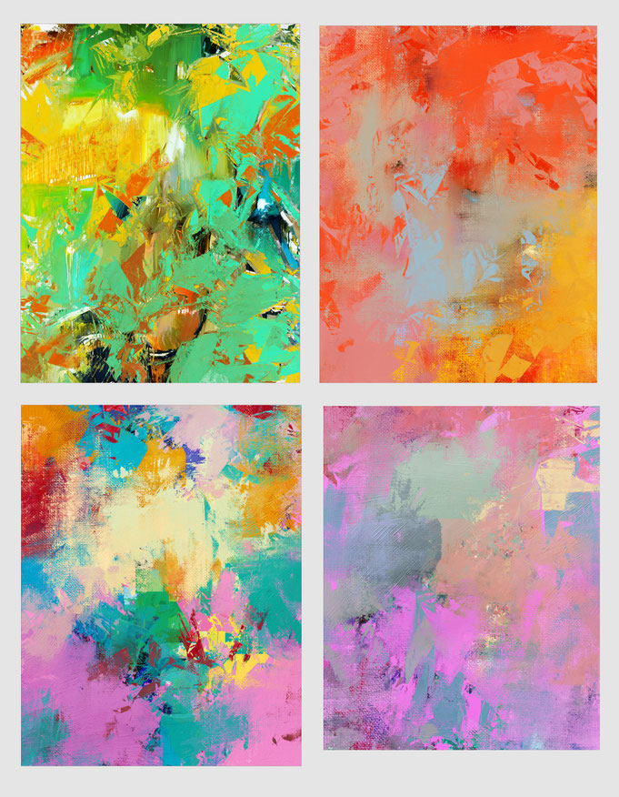
Für dieses Bild habe ich eines meiner Crazy Canvases verwand, die ich neulich in einem Blogartikel zur Verfügung gestellt habe - More Crazy Canvases for Download -
Ich habe die Farbintensität reduziert und darüber das Porträt mit einigen wenigen Strichen skizziert. In einem weiteren Blogartikel hatte ich schon einmal solche knallbunten Leinwände zum Herunterladen zur Verfügung gestellt. Wer diese noch nicht hat, findet sie hier.
For this image I used one of my Crazy Canvases that I shared in a recent blog article - More Crazy Canvases for Download - I reduced the colour intensity and sketched the portrait over it with a few strokes. In another blog article I had already made such brightly coloured canvases available for download. If you don't have them yet, you can find them here.
Auf das Bild Klicken um es zu vergrößern - Click on the image to enlarge it.


Von da an bin ich bei der Farbgebung nur noch meiner Intuition gefolgt, begleitet natürlich von der ständigen Kontrolle über den schwarz/weiß Modus. Schon in einem sehr frühen Stadium gefiel mir, wie der Bowlerhut allein von der geschwungenen Unterseite und einer Linie oben links definiert wurde. Ich beschloss bereits da, den Hut nicht weiter auszuführen, sondern mit dem Hintergrund verschmelzen zu lassen.
From then on I just followed my intuition when it came to colouring, accompanied of course by constant control over the grey scale mode. At a very early stage, I liked how the bowler hat was defined only by the curved underside and a line at the top left. I decided already then not to elaborate on the hat, but to let it merge with the background.
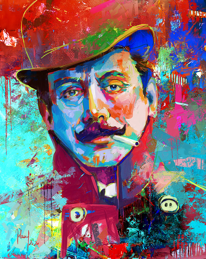
Bis zum fertigen Bild habe ich versucht mit Farbklechsen, Mustern und Drips visuelles Interesse zu schaffen, wobei ich ausschließlich mit Aquarell- und Ölpinseln in Rebelle 4 gearbeitet habe.
Until the finished painting I tried to create visual interest with colour splashes, patterns and drips, working exclusively with watercolour and oil brushes in Rebelle 4.
Und so sehen die 4 neuen Crazy Canvases aus, die ihr euch im Anschluss herunterladen könnt.
And this is what the 4 new Crazy Canvases look like, which you can download below.
Und ich freue mich natürlich über jede Spende!
And of course I am happy about every donation!
Kommentar schreiben
Per Ole Spilde (Sonntag, 24 Oktober 2021 15:36)
Thank you for explaining your process of work. I am reading, and learning. Great work. I particularly like your experience with the use of colors, that it does not influence the final result whatever color you pick, as long as the values are correct.
Lana Frye (Montag, 25 Oktober 2021 02:43)
Thank you for posting these great canvases but also a glimpse into your technique.